When I partnered with Toyboxtown, a small business rooted in screen-free sensory play and community-centered parenting, the brand’s social presence was just beginning to take shape. Over the past year, we’ve built a strong, engaged audience from the ground up—with consistent growth in both reach and connection across Instagram and other platforms.
My role has been comprehensive: I’ve led strategy, designed custom graphics, and produced reels that reflect the brand’s humor, honesty, and heart. Each caption is crafted to resonate with real moms navigating the beautiful chaos of toddler life. Through consistent hashtag research and optimization, we’ve maintained strong visibility and reach in niche parenting circles.
Beyond social, I helped Toyboxtown redesign their website to reflect a warmer, more community-oriented feel, and supported their product packaging for a new launch to align with the brand’s evolving identity. From heartfelt story-driven posts to playful reels and community prompts, our content strategy has remained focused on connection over perfection—and it’s paid off in a steadily growing, loyal following.
From Seed to Sensory: Growing Toyboxtown’s Online Community with Heart
TOYBOXTOWN


🎥 Video Content That Resonates: Reaching Beyond the Bubble
One of the most impactful parts of working with Toyboxtown has been shaping raw, everyday footage into high-performing, community-driven content. I regularly receive spontaneous clips from the founder, Victoria—real moments of motherhood, messy playtime, sibling dynamics, and mom humor that are full of heart and relatability.
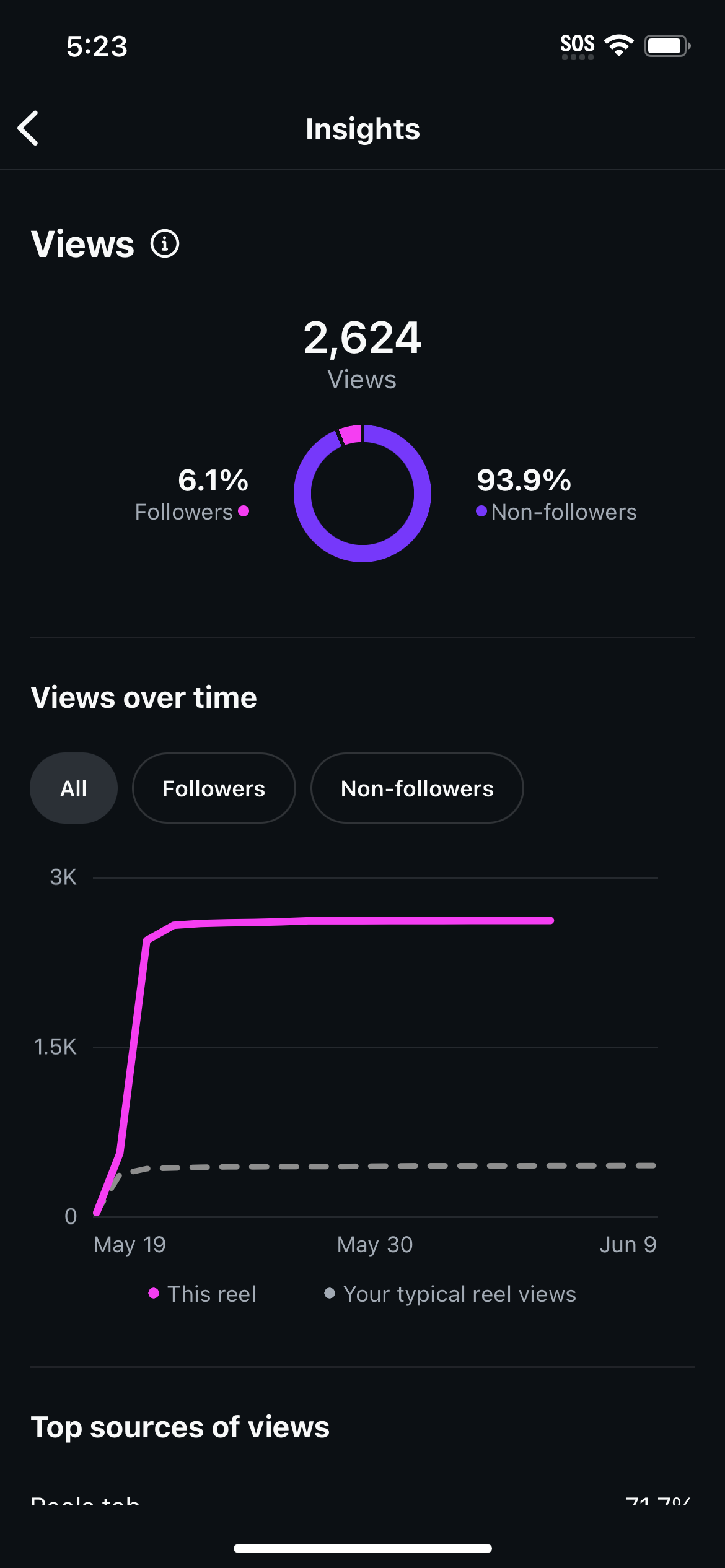
Instead of producing overly polished reels, I focus on editing these snippets to preserve their authenticity while enhancing them with thoughtful captions and strategic hashtags. One standout example: a playful video that reached 93.9% non-followers organically—2,121 accounts in total. That kind of reach shows just how powerful unscripted, real-life content can be when paired with the right tone and strategy.
The magic lies in matching the footage with the right audio trend, writing a caption that feels like a conversation in a mom group chat, and tagging it with highly relevant hashtags like #MomLife, #SecondBornVibes, and #UnpluggedPlay. These videos aren’t just scroll-stoppers—they’re connection points. They invite other parents in with a laugh or a “same here” nod, which is exactly how we’ve built such a loyal and growing community.
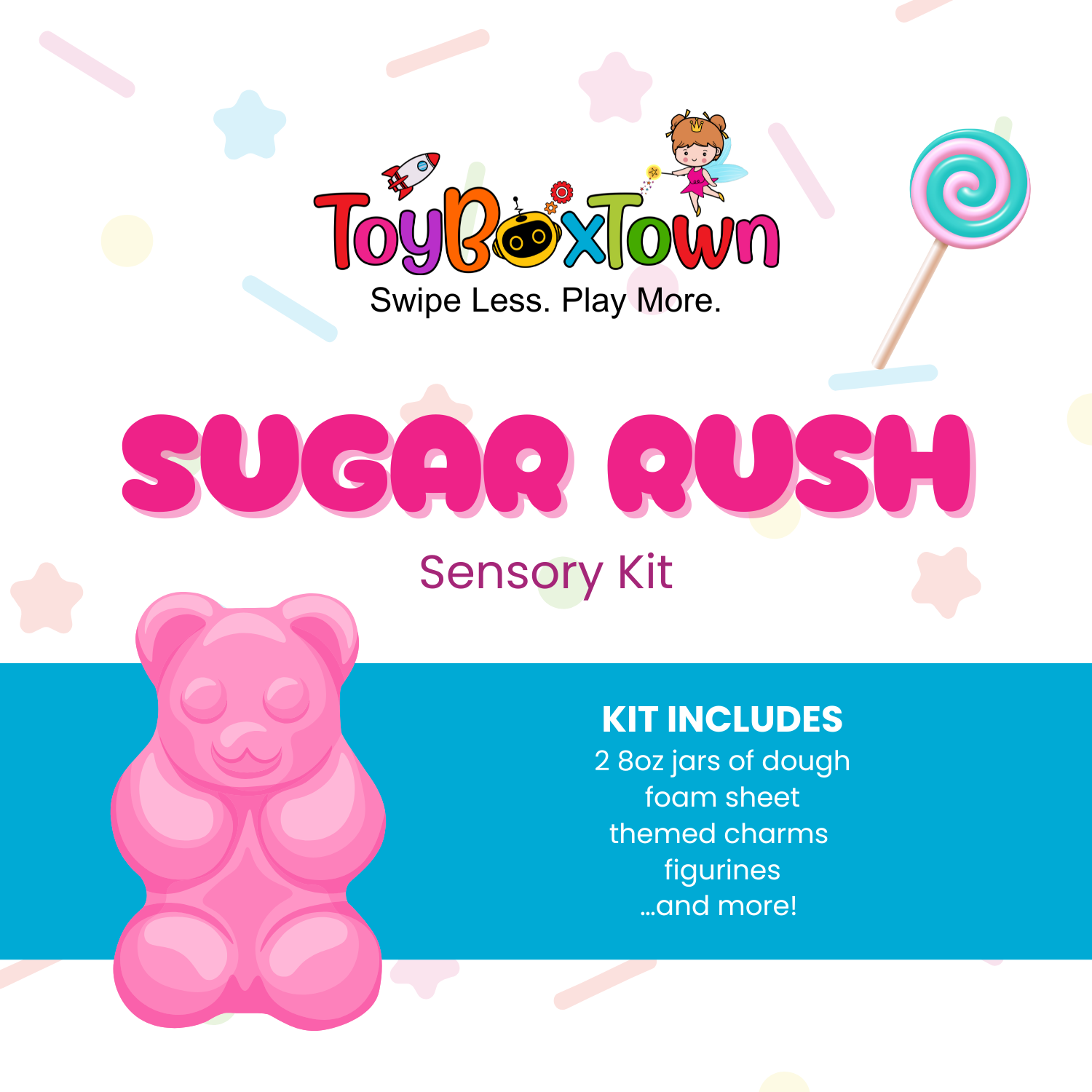
📦 Designing Connection: Supporting a Sensory Kit Product Launch
When Toyboxtown prepared to launch a new line of sensory kits, I had the opportunity to lead the creative direction on packaging design—a project that blended visual storytelling with strategy.
I designed six unique product packages, each one playful, colorful, and intentionally crafted to grab attention from both kids and parents. The goal was to make the kits feel fun and approachable while still being clean and easy to read, even on busy shelves or scrolling feeds. Every design element—from the fonts to the color palette—was chosen to align with Toyboxtown’s warm, screen-free play mission and stand out in both digital and real-world settings.
To elevate the unboxing experience and keep the brand personal, I also created a custom thank-you insert card that ships with every order. It’s a small touch that reinforces community, builds loyalty, and makes every customer feel like part of the Toyboxtown family.
By combining thoughtful packaging with consistent brand visuals on social, we created a cohesive and memorable launch that felt true to the heart of the brand.


💻 A Fresh Digital Home: Modernizing Toyboxtown’s Website
As Toyboxtown’s brand grew, so did the need for a website that truly reflected its personality and mission. I led the full website refresh through shopify, focusing on both form and function to create a space that felt modern, heartfelt, and easy to navigate.
The new site balances playful visuals with a clean layout, making it simple for parents to browse products, learn about the Toyboxtown philosophy, and feel part of a community—not just a store. I updated typography and imagery to better reflect the brand’s core values: unplugged play, real-life parenting, and creative connection.
We also restructured the user experience to improve navigation, highlight bestsellers, and guide customers toward free resources and sensory play ideas—extending the brand beyond just products. Every page was designed to feel personal and intuitive, with touches like warm headers, thoughtful microcopy, and embedded community features.
The result? A website that feels just like the brand itself: friendly, fun, and real.